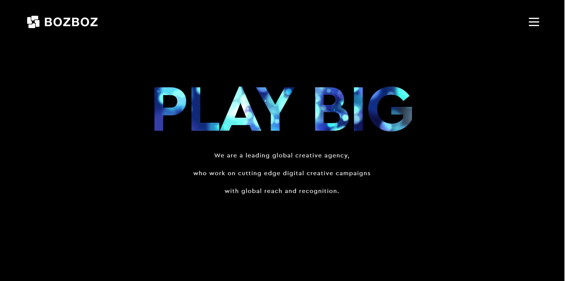
Brands constantly evolve themselves to stay at the forefront of their industry, with up to date websites, blog articles, design and technology. In Bozboz’s current phase of evolution a lot has happened, with the recent move to a new office in the centre of Brighton and the opening of our unique creative gallery space. To follow up and reflect on this continuing transformation, we’ve decided to rebrand and redesign our website.
In this article I will give you an insight into some of the processes, decisions and problems our team went through to build our new site, focusing specifically on a User Experience problem we encountered.
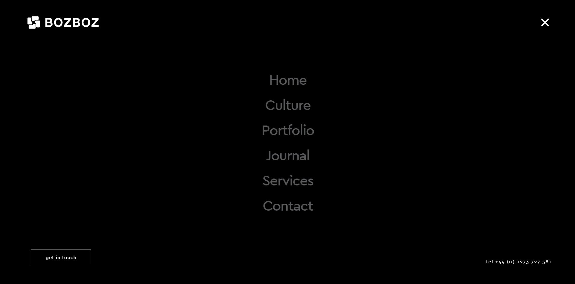
A design trend that has swept across the web in recent years has been the use of ‘hamburger menus’. This is a button represented by 3 parallel lines and when clicked upon, typically reveals menu options. The hamburger menu became popular across mobile designs due to their menu option layout on smaller screens and have now spread to larger screen sizes for the minimal aesthetic they create.
The site design was leaning towards a very minimal black and white aesthetic, making the small and sleek hamburger menu a very obvious design choice to help fit into our desired aesthetic. When the hamburger menu is activated, a full screen navigation for the site appears.
The site’s page hierarchy is incredibly simple, with 6 primary ‘parent’ pages and three sets of deeper ‘child’ pages found in the Portfolio, Insight and Services sections.
Our menu does not allow you to access the child pages for two reasons; we did not want to spoil our minimal layout and present the user with too many options at this stage.
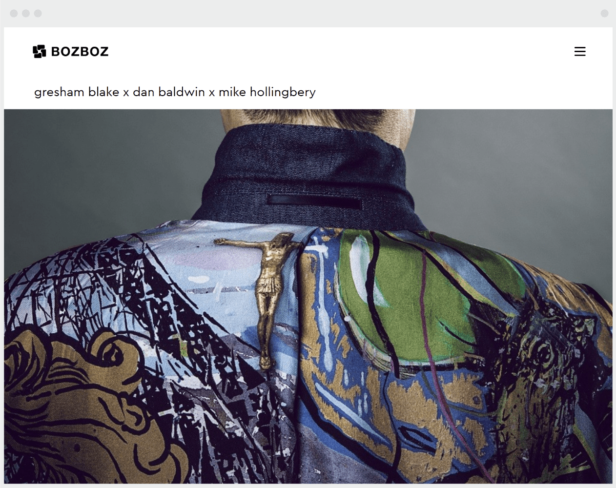
If you navigate into a child page, the problem can be spotted. The design of these pages didn’t highlight the fact you’re in a child page, with no page titles present or signifier for the user.
This was a big UX nightmare. If the user landed on a child page by a sent a link or through a search engine then you wouldn’t have a scooby doo where you were on the site. We needed some sort of visual cue to highlight the user journey.
As a team, we sat down to discuss possible solutions. We knew that a breadcrumb would suffice, however we wanted to put our own spin on it to tie in with the site design. After many iterations and design discussions, we settled on placing the breadcrumb next to the hamburger menu.
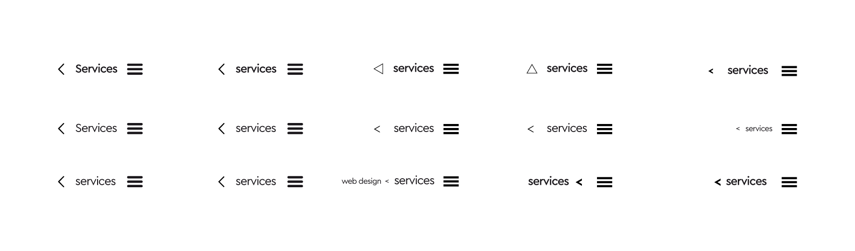
Designs were critiqued by the team and tested on internal staff to make sure the UI was clear to people who hadn’t worked on the site. These tests were an integral part to choosing the final design. It’s incredibly easy as designers/developers to assume a user can navigate a site easily when you’ve worked so closely with the project.
A simple word displaying the parent page was chosen as the breadcrumb. This breadcrumb would also have a secondary function as a link button to the parent page, to save the user opening the menu.
This small breadcrumb cures various UX issues by not only providing a map for the user, giving them re-assurance that they know where they are, but also gives context to the content you’re currently reading.
Such a small detail shows how important good UX is for a website because it can be the difference between a user finding the information they want quickly and easily, or bouncing off the page onto another site.


If you want to showcase your offering, convert more leads, provide resources, or all of the above, we can build a website that separates you from the competition.